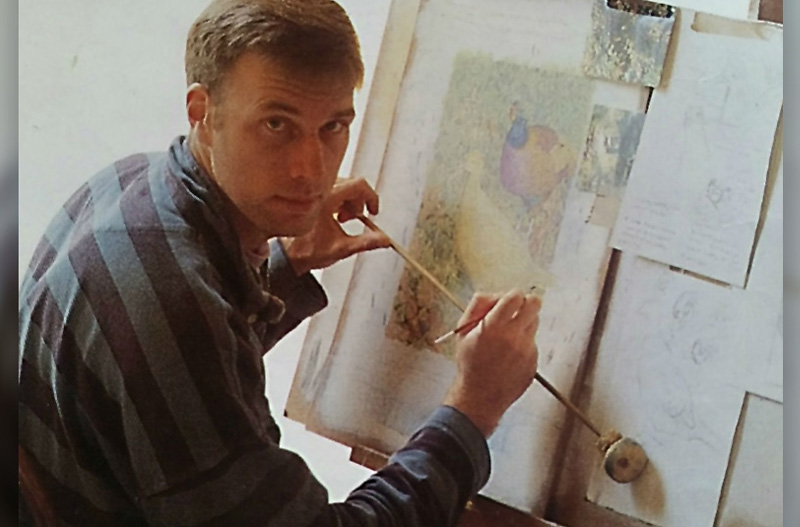
Based on a very old article I did when I was in my late 20s (see the hairy guy I once was!) I want to demonstrate how I paint with oils. This technique was shown to me by Ray Harris Ching when I worked in his studio in Melbourne and London. I have perfected the technique of building up thin layers of colour, called glazes, over the past 30 years. The demonstration piece is one of Common Pheasants called “An English Autumn”, which I painted in 1991.
The start: Based on good reference I do my underdrawing and try to work out any problems I may encounter later on - compositions, colour and size/proportions when using different reference for one painting. These drawings are very detailed and include a lot of tone, especially where the contrast is at its greatest. Each line is there for a reason and must be correct or the effort spent later will be wasted. Once I am satisfied that all the qualities I look for are captured, I spray it with workable fixative before applying three thin coats of Ultramarine Blue and Alizarin Crimson. This helps fix the drawing, kills the white of the canvas and adds tone. Its transparency means you don’t lose your underdrawing. Now it starts to get exciting.
The first colours: As I have been very exacting with the drawing and underpainting I can afford to quickly paint in the colours. At this point it’s interesting to note there are 2 distinct colour forms in the birds. The male has large areas of iridescent colour i.e. reflecting light. In contract the female is absorbing colour, giving a slightly different texture. Transparent paint is ideal for the male’s vivid colours. I begin by laying down thin layers of Ultramarine Blue and Permanent Green, slowly building up my darks with pure colour, each one layered on top of the last. Be careful when using White, as this can tend to give your colours a muddy appearance. You may only need to add White as the very end, when you require some areas of strong light. So next time you want to get a very strong iridescence on your Blue Fairy-wren, remember: use pure transparent colour, get as much tonal variety as possible (make your darks VERY dark and your lights VERY light). Never be timid in getting as much contrast as possible.
Light is being absorbed not only by the female, but also by the vegetation, so I add plenty of body colour (Opaque White) and lay it down reasonably thickly. The addition of White tends to give a more natural rendition of paler tones. The use of a larger brush stops you spending too much time on finicky areas. You may have noticed the use of Warm Yellow on the male’s wattles. This is under-painted so the addition of a red glaze will give it a greater richness. The same method is applied to other areas such as the female’s eye – even the rich yellow of the female is primarily in the under-painting.
Refining the tones: As the painting begins to develop I pay particular attention to the tones - slowly refining both darks and lights. It’s also important to keep the edges accurate; remember the shapes, the roundness of the birds and the hard flat edge of the grass. Plumage is also beginning to take shape, although I’m only suggesting feathers by tone and shape. The finer details will be added later.
Slowly achieving depth: I continue to define more of the birds plumage. It’s also time to work up some of the darks. Some of the areas that will eventually be in shadow are built up with plenty of colour, so when I glaze over the top, some of the lovely underpainting will show through. By now most of the painting has at least five coats of paint, each one thinly laid on top of the previous. To some this may seem like a waste of time, but what it achieves is the opportunity to pick up the slightest variation in colour and tone – as well as the desirable effect of one colour showing through another. Time well spent!
Final touches: All the shadows on the birds and vegetation are glazed over with Paynes Grey. The result is a very accurate colour rendition of both the browns and greens, as well as the beautiful mauve colour in the male’s underparts. Paynes Grey is a very adaptable colour! Once the paint is dry I put in the dense blacks. The leaves and grass have some lovely areas of sunlight that seem to dance across the painting. Finally I work on the paleness of the female, careful to keep the warm yellows showing through to the very end. I also use the body colour to heighten the three-dimensional side of the female. I stop when I feel I’ve pushed it as far as I can without overworking it.
Although this painting is over 25 years old, I still work this way with glazes over a detailed drawing and tonal underpainting. I hope you have gleaned some helpful hints to assist you in your work!